Survey Builder
Customizing Survey Colors and Fonts
Set your survey's primary and secondary colors, background, text color, font, corner rounding, and button style by hand.
Overview
Set your survey's primary and secondary colors, background, text color, font, corner rounding, and button style by hand. Everything lives in the same Survey Theme dialog as the presets.
Step-by-step
Open the theme editor — Tools → Theme in the builder.
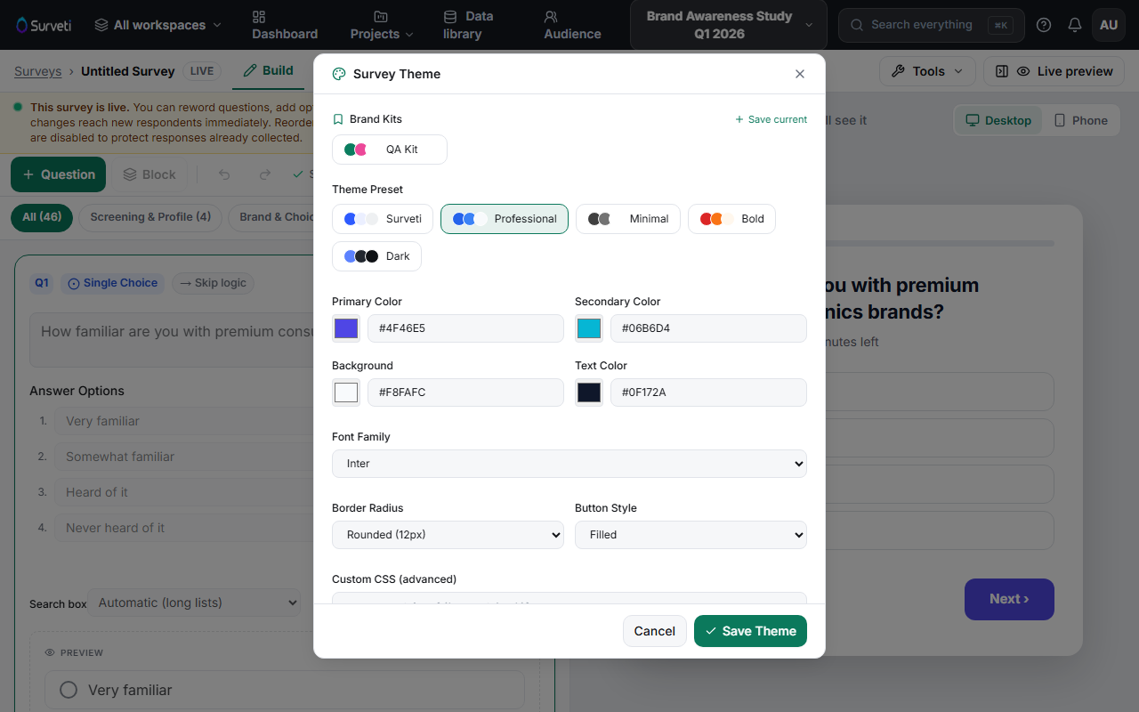
Set the colors — Primary Color (buttons, progress bar, selection states), Secondary Color (accents), Background, and Text Color. Enter hex values directly or use the swatch pickers — paste your brand's exact hex codes for a faithful match.
Pick the Font Family — choose from the font dropdown; the taker loads it for all question text and controls.
Tune the details — Border Radius (sharp to rounded corners) and Button Style (filled or outlined) set the survey's overall feel.
Go further with Custom CSS if you must — the Custom CSS (advanced) field accepts overrides for cases the controls don't cover. Use sparingly; it's yours to maintain.
Save and check contrast — click Save Theme, then look at the Live preview: text must stay readable on your background, and the primary color must be visible on both buttons and selected states.
Tips
Tip: Test your palette on Phone in the live preview — thin fonts and low-contrast brand colors that look fine on desktop often fail on mobile in daylight.
Note: Once the theme matches your brand, click Save current under Brand Kits so the whole workspace can apply it in one click.
Related articles
- Applying a Theme Preset to Your Survey — start from a preset
- Setting Up Brand Kits for Your Organization — share the result