Results & Analysis
Switching Between Bar and Pie Chart Views on Choice Questions
Toggle a choice question's summary card between bar and pie views to suit what you're comparing.
Overview
Toggle a choice question's summary card between bar and pie views to suit what you're comparing — bars for ranking options against each other, pie for showing shares of a whole.
Step-by-step
Open the Results tab — click Results in the builder.
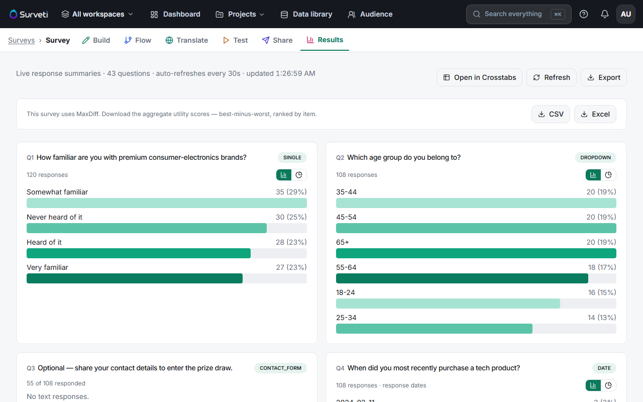
Find the toggle icons — each choice card has two small icons next to its response count: a bar-chart icon and a pie-chart icon.
Click to switch — the card re-renders in the chosen view. Each card remembers its own view, so you can mix within one dashboard.
Which view to use
| View | Best for |
|---|---|
| Bar | Comparing options against each other, and long option lists |
| Pie | Showing how a single question's answers split into shares of 100% |
Tips
Tip: Default to bars. Humans compare lengths far more accurately than angles, so a bar chart reads faster for everything except a simple "what share of the whole" story with a handful of options.
Note: Pie charts get unreadable past ~5 slices, and they only make sense for single-choice questions. A multi-select can total more than 100%, so shares of a pie would mislead.
Related articles
- Reading Your Survey Results Dashboard at a Glance — the dashboard overall
- Interpreting Mean and Distribution Charts for Rating Scale Questions — how scale cards render